
Design probably won’t make or break your business if you aren’t in an art-heavy industry, but what design does well is provide your brand a better holistic feel.
Through clean, pleasing designs and consistency throughout the many faces and outlets of your business, you can project professionalism and make yourself more recognizable to your target audience.
The Web is an easy place for shortcomings to manifest
These days, it’s really easy to get your business online—whether it be through a website or a blog. Popular platforms such WordPress are very simple to set up and get rolling in a matter of a few hours.
One of the best things about these platforms are that they are Web-based and have their own simple editing software, which means you don’t have to know a bunch of coding languages to get your content online and keep your site updated. That’s great!
However, easy as these platforms are to start up and manage, they don’t really offer a lot of guidance when it comes to design. That’s one thing that is easy to neglect. If someone is in a highly technical trade, there is a good chance he or she does not have design or art skills—and that’s okay!
If you are on a tight budget, hiring a graphic designer for your blog or website is probably not a top priority. It’s always a good idea to get professional help when designing products for your brand, but by following a few simple guidelines, it’s possible to create online content that looks professional and is easy on the eyes.
- Keep it simple! Often the worst design is overdesign. Too many graphics or gaudy typefaces quickly clutter an otherwise workable design. Let your page breathe a little by de-cluttering and adding some white space.
- Don’t use silly fonts: Limit your text to one or two simple Web fonts that can be easily read. Read any newspaper and you will rarely see more than two fonts—one for the headline and one for the body text. Newspapers are designed to be as readable as possible, so take some cues from them!
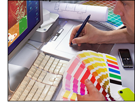
- Know your color theory—or stick to monochrome: It’s easy to get carried away with colors when working with Web-based editors. If you don’t know anything about color theory, stick easy-to-read color schemes that come with the editor or opt for a simple black-and-white design. Black text on a white or very light background is easiest to read, so if you plan on having a lot of text, stick to something readable!
The most important thing to know about design is that before anything else, your design’s basic function comes first, and that function is spreading information. If your design limits your ability to accomplish this goal, you need to rethink your design. If something is hard to read, people won’t read it—no matter how pretty it is.
If you think you need help with design, it’s always a good idea to get in touch with a professional graphic designer. The right designer will get you something that looks great and is effective at spreading your message.


